
Your art.
Multiplied.
A creative studio built around your imagination. A visual identity built around the way you create.
BRAND SYSTEM / 02.1 · SEPTEMBER 202601 / The idea
Artists bring the original idea. Puffles gives them control over how that idea becomes a collection. Every trait, rarity and combination belongs to the creator. Generation and export are free.
Three horizontal layers form a single P. The cuts express the product’s central action: individual pieces coming together, while staying recognizably themselves. The flat mark is the identity’s master; its glass interpretation adds depth in larger brand moments.

02 / Logo use
Keep it clear.
Use the supplied outlined SVG master whenever possible. Keep empty space around the logo equal to half the symbol’s width. Use the full lockup at 120 px or larger; use the symbol alone at 20 px or larger. At favicon sizes, use the provided favicon.
Use baby blue and ink on white or Snow. Use the reversed white logo on Ink. The profile image uses a baby-blue mark on a solid white background, with enough padding for circular crops.
Keep it consistent.
Keep the three cuts, geometry and spacing intact. Never stretch, retype, redraw, outline or add effects to the flat master. Do not place it over busy artwork. The blue glass sculpture is a separate campaign asset, not a replacement for the small UI mark.
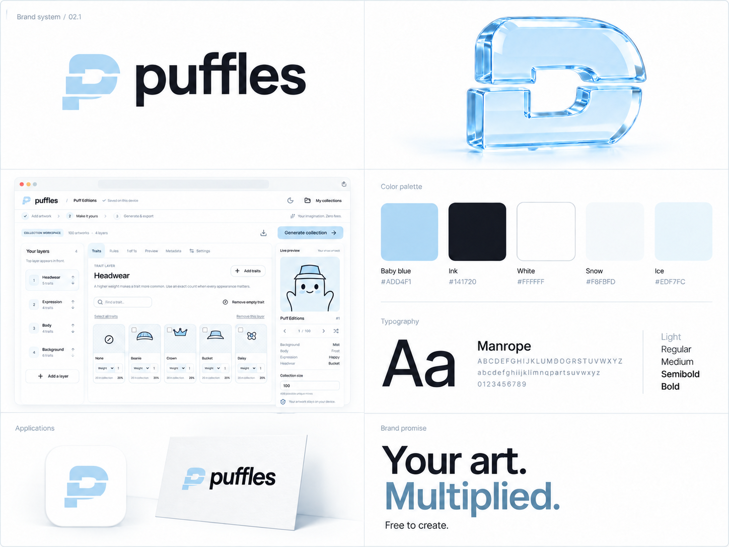
The overview panels are illustrative applications. Use the supplied vector and PNG masters for actual production logos.
03 / A disciplined palette
White is the dominant surface. Ink provides clarity. Baby blue adds gentle color to actions and the logo. Snow and Ice add just enough depth to separate surfaces.
Default interface: pure white page and content surfaces, Ink text, and slightly deeper #9BC9EB baby-blue actions with dark #173C56 labels. Hover fills use #88BEE4 and soft highlights use #E9F4FB. Links and focus rings use #315F82, headings may use #487596, and secondary text uses #586B79. Baby blue is a surface color, not a small text color. Dark mode uses #0E1119 page, #171C28 surface, #EEF2FC text and #9BC9EB accents.
04 / Typography
Headlines 600–650. Logo 750. Body 400–500. Controls 600–650. Use clear sentence case, generous line height and short paragraphs.
0123456789
Small quantities, technical values, file details and metadata. Use sparingly; regular body copy stays in Manrope.
Marketing headlines scale from 40–94 px. Body copy is 14–16 px, and dense workspace controls are 12–13 px. Both families use the SIL Open Font License. License files and font assets are included.
05 / Glass, with a purpose
Material hierarchy
Use translucent material for navigation, floating controls and supporting preview surfaces. Keep artwork canvases, forms and long reading areas solid enough to stay clear. White glass: approximately 82% white with 24 px blur, a fine bright edge and a restrained cool shadow.
Accessibility
Provide solid backgrounds when transparency is reduced or unsupported. Honor reduced motion and increased contrast. Focus rings stay visible. A material effect must never be the only way to identify a control or state.

06 / Motion and interaction
Motion should explain a change or acknowledge an action. Controls respond in 150–180 ms. A short initial reveal may fade and rise 18 px over 550 ms; play it once. Keep tools responsive while generating in a worker. Do not add continuous floating, particles, scroll hijacking or simulated progress.
Use clear hover, selected, loading, error and success states. Menus and dialogs work with keyboard navigation. Respect reduced motion for both CSS transitions and animated entrances.
07 / Images and voice
Art direction
Pale baby-blue optical glass, white porcelain and silver chrome. Sculptural forms, controlled reflections and soft studio lighting. Keep backgrounds calm. Product screenshots show the real interface and real sample data.
The 3D Puff portraits are brand illustrations. The included editable generator demo uses a separate set of flat 2D image layers. Puffles combines image traits; it does not turn flat artwork into 3D models.
How Puffles speaks
Direct, welcoming and specific. Explain what a creator can do next. “Create a collection.” “Your artwork stays on your device unless you choose a cloud build.” “Download images and metadata.”
Use the campaign line “Your art. Multiplied.” Describe generation and export as free. External hosting and blockchain minting may have their own costs. Never suggest an investment return.
08 / Social identity
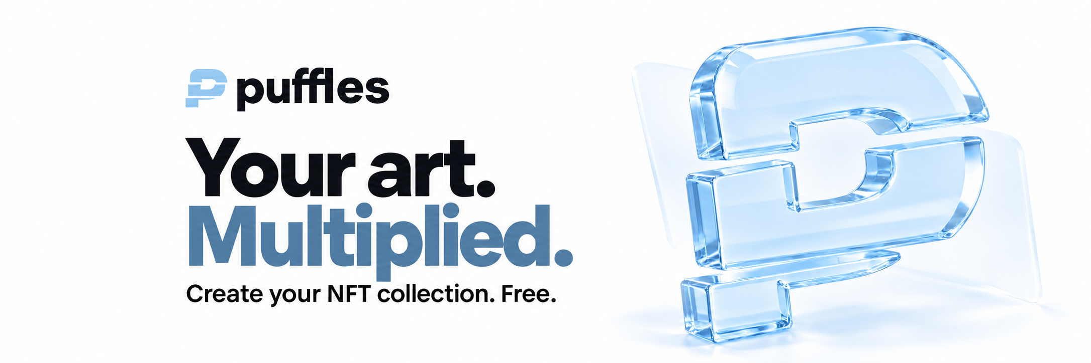
The profile image is 1024 × 1024, with a white background. The Twitter/X cover is 2171 × 724, a 3:1 header. Preview its crop in the social platform before publishing. Essential copy sits away from the bottom-left avatar area.
09 / The system together
10 / Research and references
This original direction draws on material hierarchy in Apple’s Human Interface Guidelines, navigation and spacing on Mobbin’s public site, contemporary interface references on Recent, and the Awwwards blue website gallery. The public pages informed the decisions; paid libraries were not accessed.